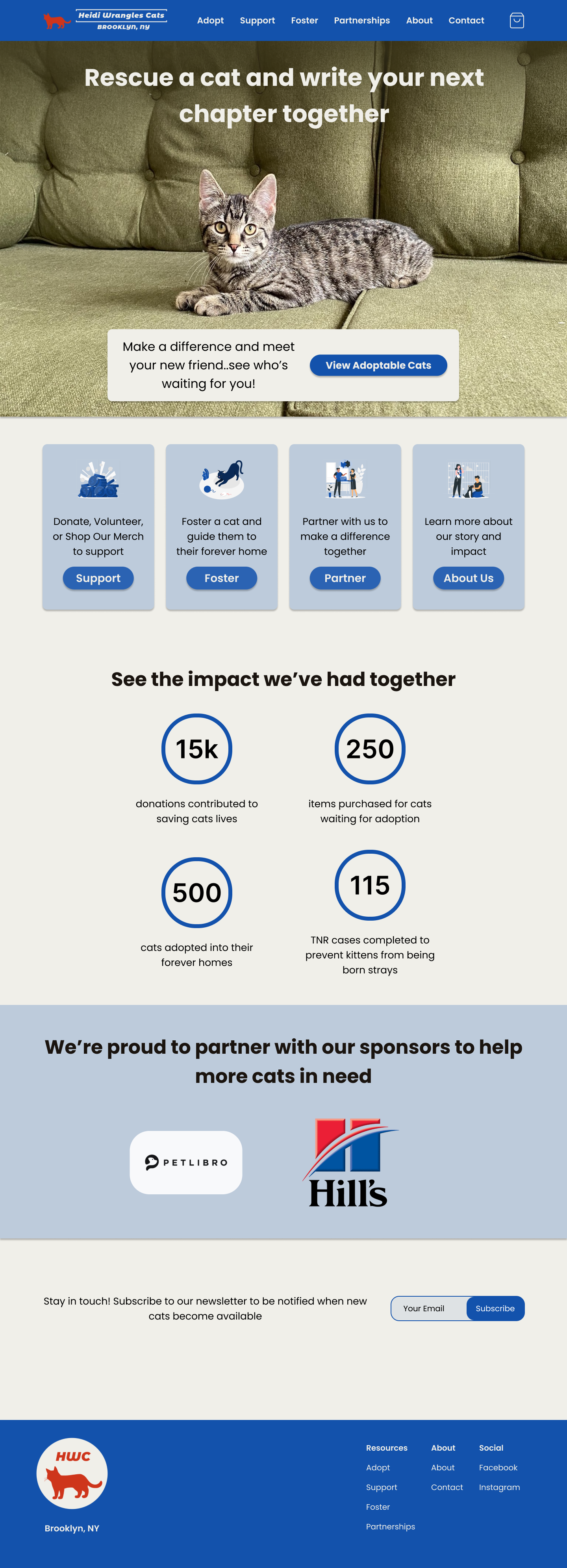
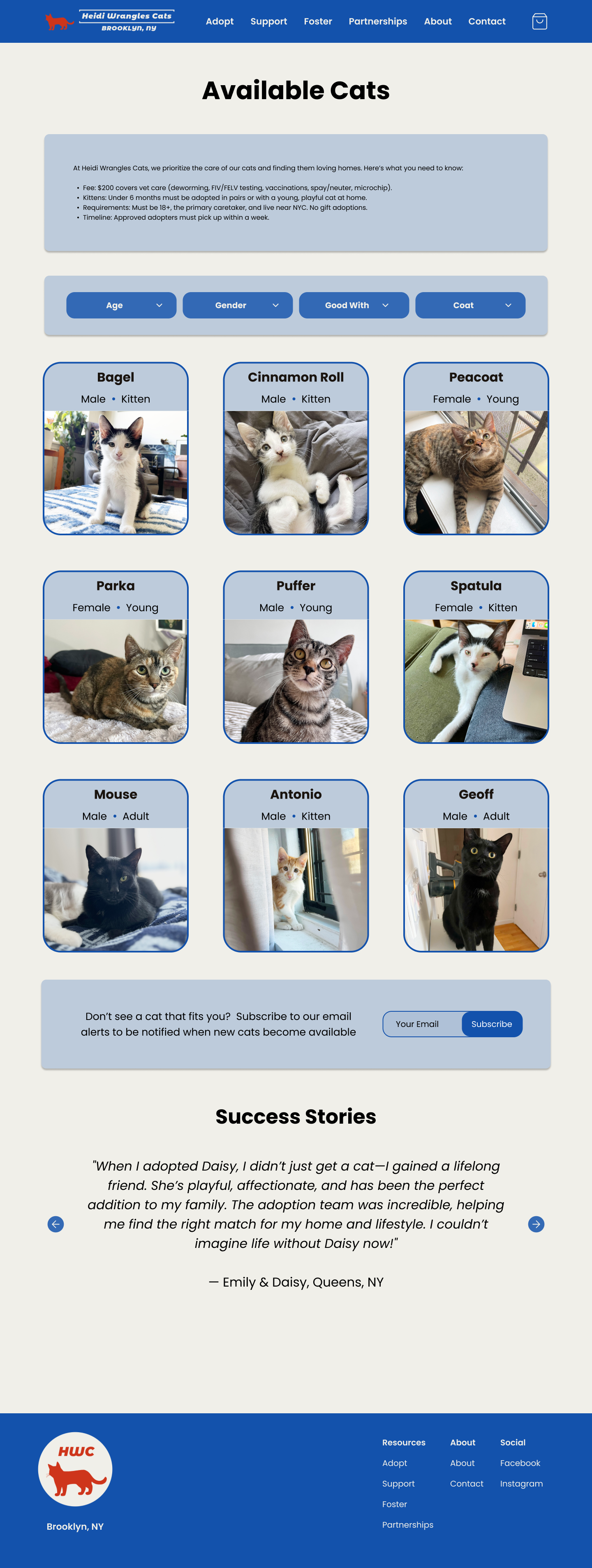
Enhancing the web experience by unifying the brand and showcasing their story in a mobile responsive website
Roles: UX/UI Designer, UX Researcher, Brand Strategist
Timeline: 2 weeks
Toolkit: Figma, Maze
Adopting a pet is a big decision, and users expect a clear, trustworthy, and easy-to-navigate website
This project focuses on redesigning the website for Heidi Wrangles Cats, a Brooklyn-based cat rescue, to better reflect its strong brand identity and improve user experience. With most visitors accessing the site via mobile, the redesign will prioritize mobile optimization, addressing issues like difficult navigation, poor formatting, and slow loading times. The new site will provide a unified platform that tells the organization’s story, showcases adoptable cats, simplifies the adoption process, and inspires action through features like a searchable cat database, adoption guides, impact infographics, a merchandise store, and integrated social media content.
The problem
Heidi Wrangles Cats has built a strong, engaging brand on social media with a loyal and supportive audience, yet the website falls short in reflecting this identity. It lacks alignment with the brand’s story and fails to deliver a seamless, user-friendly experience.
Research highlighted opportunities for a responsive website that stands out, while user interviews revealed key insights into pet adopters' expectations
Competitor Analysis
I reviewed three similar cat rescue organization websites. The competitive analysis highlighted similarities across organizations, including resources for adoptable pets, application forms, volunteer signups, and transactions for donations, merchandise, and adoption fees. However, key differences emerged in the execution of these features. Adoption forms ranged from manual processes (print, handwrite, scan) to seamless web forms. Some sites offered well-organized sitemaps for easy navigation, while others were outdated with dead links. Brand storytelling also varied significantly, with some organizations effectively inspiring donations through compelling narratives and others offering only a basic donate button without context.
Opportunities identified include creating a clean, action-based sitemap (e.g., donate, adopt, partner, volunteer) to enhance usability, leveraging brand storytelling to connect with potential donors, and integrating links directly into the site to reduce user reliance on external platforms. A unified and intuitive website experience could also alleviate the confusion users face when navigating multiple platforms for adoption processes, particularly given the prevalence of social media links and scattered external resources. This analysis underscores the need for a cohesive and user-focused digital presence to set organizations apart in the crowded pet adoption space.
User Interviews
To understand user needs and pain points in the pet adoption process, I conducted five interviews with current pet owners who had previously adopted pets. These 20–30-minute interviews revealed key insights: users typically explore adoptable pets on mobile devices, and lengthy or manual application processes often lead to missed adoption opportunities. Participants consistently expected to find "Adopt a Pet," "Donate," and "About Us" sections on an animal rescue website, with adoptable pets being the primary focus. Transparency was a recurring theme—users wanted clear information on the adoption process and where donations were allocated. Additionally, participants expressed a desire to engage with rescue organizations beyond adoption, valuing unique brand stories and staying connected with organizations they trusted. Lastly, users noted they evaluate a rescue’s credibility through the website’s design, citing a "sketchiness" factor as a barrier to trust. These findings underscored the importance of a transparent, user-friendly, and engaging website experience for rescue organizations.
The goal
Design a responsive website that brings the cohesive brand story to life, ensures consistency across platforms, and builds trust and legitimacy in the business—all while delivering a seamless user experience that inspires engagement and motivates users to take action.
Post-research, a clear direction emerged—I refined the problem by creating an affinity map, user personas, and aligning insights with project goals
Affinity Mapping
The user interview conversations provided me with several strong directions of data of to follow, to confirm these trends I created an Affinity Map.
Here’s what I found:
Trust Factors: Trust is crucial; users avoid organizations with disorganized or “sketchy” online presences. A polished, transparent website builds confidence.
Brand Reputation: HWC’s creative, engaging brand sets it apart. Users value feel-good content and personal connections, offering HWC a chance to outshine less reputable rescues.
Donations & Merchandise: Transparency around donation impact and progress is key. Users want clear details to feel confident supporting the organization.
Application Process: Online applications are preferred over lengthy, paper-based ones. Clear, simple steps improve the user experience.
Pet Search: Mobile dominates pet browsing, with Google and Petfinder as starting points. A strong web presence is essential to attract adopters.
Website Content: Users expect core sections like "Available Pets," "Donate," "About Us," and "Resources." Clear processes, impactful stats, and high-quality photos enhance credibility and engagement.
User Personas
At the end of my research synthesis, I developed three User Personas. These personas would help to direct the rest of the design by providing a point of view for the various visitors to the website.
Project Goals
Despite this project involving a small business, the review of the business and user goals was an important step. This small business operations with a very small team and limited resources, so mapping out the project goals to align with this unique business was an important checkpoint in the process.
Samples of the affinity map:
While cats and "problems" rarely go together, designing effectively required addressing user challenges. I crafted How Might We statements, narrowing them to two problem statements
How might we share the rescue’s story in a way that inspires visitors to adopt, foster, or donate?
Problem Statement #1:
Visitors to Heidi Wrangles Cats' website—including potential adopters, fosters, donors, and partners—struggle to feel connected to the rescue’s mission because the site fails to communicate a unified and succinct story of the organization’s work and impact. This lack of engaging, narrative-driven that HWC is known for makes it feel disjointed from their social media presence and difficult for users to easily understand the full process or details behind adopting, fostering, or donating, leading to missed opportunities to take action.
How might we create a mobile-friendly website that aligns with the organization’s engaging social media presence and strong brand identity?
Problem Statement #2:
The majority of the actions taken on any animal rescue’s website are done on a mobile device, but the current site for Heidi Wrangles Cats is not optimized for mobile use. This experience is misaligned with the organization’s well-curated social media content and strong brand identity, making the mobile site feel disconnected from the vibrant and engaging brand users expect. As a result, this leads to decreased engagement and missed opportunities to support the organization.
With two problem statements defined, I moved into design, expanding the existing brand framework with a logo and design kit
User Flows
I started out by considering what flows the users would go through, focusing on four key flows. I came back to these User Flows a few times and after developing wireframes and completing User Testing. Example user flow:
Sitemap
The sitemap was a crucial step in the design for this project as website navigation was identified as one of the user pain points when access pet rescue organizations. I leveraged the conversations from user interviews to align the sitemap with what users expect to find when going through the pet adoption process.
Style Tile & UI Kit
Low Fidelity Wireframes
With so many ideas swirling, putting pen to paper forced me to get specific and focus on how these concepts could effectively translate into a seamless user experience. This required mapping out a few different variations of my key screens and not getting too attached to one solution path, an open mind was essential to these first designs.
Mid Fidelity Wireframes
High Fidelity Wireframes


Usability Testing & Priority Iterations
Usability testing aimed to evaluate four key user flows on the Heidi Wrangles Cats website, testing two on desktop and two on mobile. Five participants completed tasks including fostering a cat, adopting a cat, donating via PayPal, and submitting a partnership request. All tests were conducted unmoderated via Maze, using metrics such as dropoff rate, success rate, misclick rate, and average task duration.
Key findings:
All flows achieved a 100% completion rate with no dropoffs.
The average ease-of-use score was 9.8/10, with 80% of participants rating a perfect 10.
Task durations ranged from 19.5 seconds (Partnership Request) to 55.8 seconds (Adopt a Cat).
Misclick rates were highest for the Foster (23.1%) and Adopt (20.5%) flows, indicating potential areas for refinement.
Revision #1 - Clarifying Adopt vs Foster CTAs
A clear CTA on the homepage is important to one of the main user flows, adopting a cat.
Based on usability testing, it was revealed that available cats could be interpreted to be available cats to foster. For a clear CTA, the wording of the CTA button was updated.
Revision #2 - Mobile menu
During usability testing, participants reported that they often use the Navigation Bar / Menu rather than relying on the CTA cards on the homepage.
For a complete prototype experience, a menu was added to all mobile screens.
Revision #3 - Navigation
The Heidi Wranlges Cats brand is known for their engaging social media content, incorporating this into the adoption flow will expand the information available about the cat and also thread the brand experience between web and social media.
“Connect on social” section blends in visually with the other sections, while also distinguishing itself among the top standard information sections.
Revision #4 - Look and feel updates
In general, reviewing and updating the visual hierarchy and layout of pages helped to improve the user experience.
The final design
The final prototype introduces a responsive website design for Heidi Wrangles Cats, delivering:
A Unified Brand Experience: Consolidating all aspects of the organization into one cohesive and streamlined platform.
Intuitive Navigation: Enabling users to effortlessly locate information and complete actions with ease.
Trust and Engagement: Strengthening credibility and sharing the organization's story in one place to inspire meaningful support through donations, merchandise purchases, volunteering, or adoption
Recapping my journey on this project
This project challenged me to balance a small business's needs with a tight timeline, all while delivering a meaningful and effective design.
My main learnings:
Growth:
Improved ability to identify visual misalignments in designs.
Developed a deeper understanding of responsive design by recognizing that cohesive visuals may require different designs across viewports.
Learned to design within the constraints of a small business with limited development resources.
Created cleaner Figma files and worked more efficiently with personas, task flows, and components.
Challenges:
Balanced simplicity and visual interest in a straightforward business structure.
Simplified designs by refining color schemes and section layouts for cohesion.
Key Takeaways for Future Projects:
Gained confidence in guiding small organizations through web design processes.
Realized that seemingly simple projects can present complex design challenges.
Recognized the importance of accessible menu/nav bars as an alternative to scrolling for CTAs.
Learned that maintaining consistent look and feel in responsive design often requires unique design specifications.


